Bleu Feelin Mono
TrueTypeБезкоштовна з можливістю пожертви
BlueFeelinMono-trial.ttf
Теги
Примітка автора
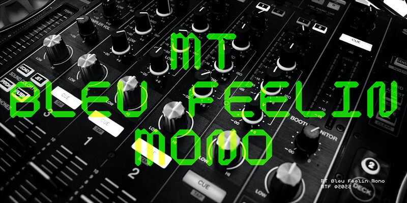
MT Bleu Feelin is a display font with a monospace typographic feel. Please pay attention to Small Caps, Oldstyle Figures, and Alternates. Good for music album covers, posters and magazines. Inspired by the electronic band from Bandung, Bleu House, which has a light and edgy electronic pop experimental music character, the idea emerged to create a font that changes from sound to visual language, namely font.
The use of the design for this font is for Display, and while it is issued one regular weight, in the future will develop multiple masters and other experiments.
The design concept of the MT Bleu Feelin Mono Regular font is to take a 45 degree diagonal and geometric cut technique. also every corner is rounded which gives a dynamic impression like electronic music.
I created this font design because I like visual experiments, and applied it to the character of the font.
By using monospaced font characters have an even width. This is a unique feature in that most fonts are 'proportionally' spaced with characters varying in width.
While monospace is perfect in certain ways, it is a proportional font that reigns supreme. Proportional fonts are faster to read. however, the MT Bleu Feelin Mono Regular font is intended for display fonts.
donation paypal : mmayarusli@gmail.com
Таблиця символів
Для перегляду різних таблиць символів для цього шрифту, будь ласка, скористайтесь меню, що розкривається.

Основна інформація про шрифт
Сімейство шрифту
Bleu Feelin Trial
Підсімейство шрифту
Regular
Унікальний ідентифікатор підсімейства
1.000;UKWN;BlueFeelinMono-trial
Повна назва шрифту
Bleu Feelin Mono
Ім´я настільної версії
Version 1.000
Ім´я поскрипт шрифта
BlueFeelinMono-trial
Про торгову марку
MTF are registered trademarks of Mametos Ltd.
Бажана сім´я
Bleu Feelin Trial
Бажана підсім `я
Regular
Розширена інформація про шрифт
Платформи підтримуються
ПлатформаКодування
ЮнікодЮникод 2.0 и прогресивна семантика, тільки Юникод BMP
MicrosoftТільки BMP юникод
Деталі шрифту
Створено2022-09-09
Перегляд1
Кількість гліфів99
Одиниць на Em1000
Права вбудовуванняДозволено вбудовування для редагування
Клас групиНе кваліфіковано
НасиченістьНапів-світлий
ШиринаНапів–розширенний
Mac стильЖирні
НапрямокТільки гліфи спрямовані зліва направо + нейтральні
ВізерунокPегулярний
ВисотаНе моноширинний